
Table of Contents
Collapse allThe Image Gallery Block in Frontis lets you upload and display multiple images in a neat grid layout.
You can choose how many columns to show, add captions, and link images if needed. It’s perfect for show portfolios, events, team photos, or products, and it looks great on all screen sizes.
Adding Frontis Image Gallery Block
To insert the Frontis Image Gallery block, go to the page or post where you wish to add the image gallery block. Next, click the + (plus) Icon located at the top of the left side of the screen.
The Frontis menu bar interface will appear to you. Search for the Image Gallery block in the search box or select it from the menu bar. Then, drag and drop the image gallery block and upload a photo.
After inserting the Frontis Image Gallery block, follow the steps below;
- Click on the Document Overview button, and you will be able to see the blocks list view on the right side.
- Click on the block; all the control tabs will show here (Basic, Style, Advanced).
Basic section
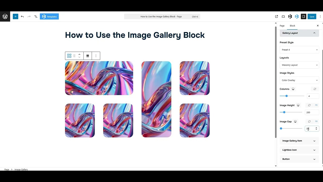
Basic > Gallery layout
- Presets Style: The presets style refers to a pre-designed image gallery segment. You can modify or personalize the Image gallery with a simple click. We offer 6 presets (including the default). You have the option to select any one of them.
- Layouts: The Layout feature in the Frontis block theme helps you arrange your website’s content in two (Grid Layout and Mesonary Layout). It lets you choose how your images and other elements are displayed.
- Image Styles: The Image Styles feature in the Frontis block theme allows you to change the image styles (None, Black and White, Color overlay). You have the option to select any one of them.
- Columns: This section allows you to adjust the number of columns to fit your content or design needs. You can easily increase or decrease the column count based on your requirements.
- Image Height: The image height feature allows you to change the height of images, making them taller or shorter based on your needs.
- Image Gap: The image gap feature controls the space between images in the gallery. Here, you can increase or decrease the value of Image Gap.
Image Gallery Item: You can add, replace, or customize an image from this section. Just click the Add Image button to upload one. You can also adjust Column Span and Row Span values for each image individually.
Lightbox Icon: To include the Lightbox icon, simply enable the switch. Once the switch is activated, the Icon section becomes visible. Here, you can add or change the icon.
Button: To include the Button, simply enable the switch. Once the switch is activated, the Button text and Button link section becomes visible. Here, you can add button text and a link.
Style Section
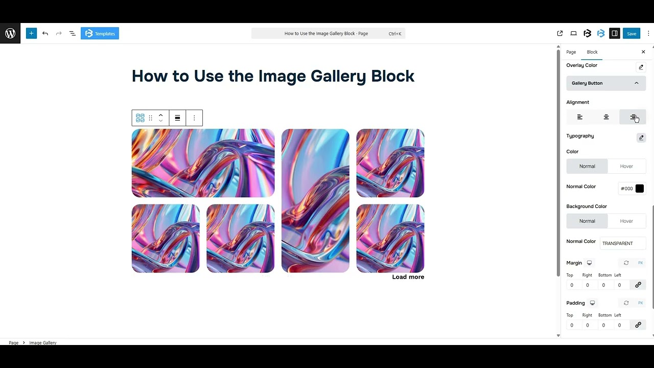
Image setting: This section lets you customize the image Alignment (left, center, right), Width, and Height. You can also adjust the Object Fit Cover by enabling the toggle option.
Border and Border Radius: Here, you can add the Border and customize the Border style, Border color, Border stroke, and Border radius.
Overlay Styles: The Overlay feature in Frontis blocks lets you add a semi-transparent layer over images. We offer five presets (From Top, From Bottom, From Left, From Right, and Zoom in Out). You have the option to select any one of them. You can also change the overlay color from here.
Gallery Button: The Gallery Button feature in Frontis blocks allows you to add a clickable button to your image galleries. This button can link to another page, a product, or any URL you choose.
- Alignment: This feature allows you to change the alignment of your Gallery button to Left, Center, and Right.
- Typography: You can change the font family, font size, font weight, font style, text transform, text decoration, letter spacing, and line height from here.
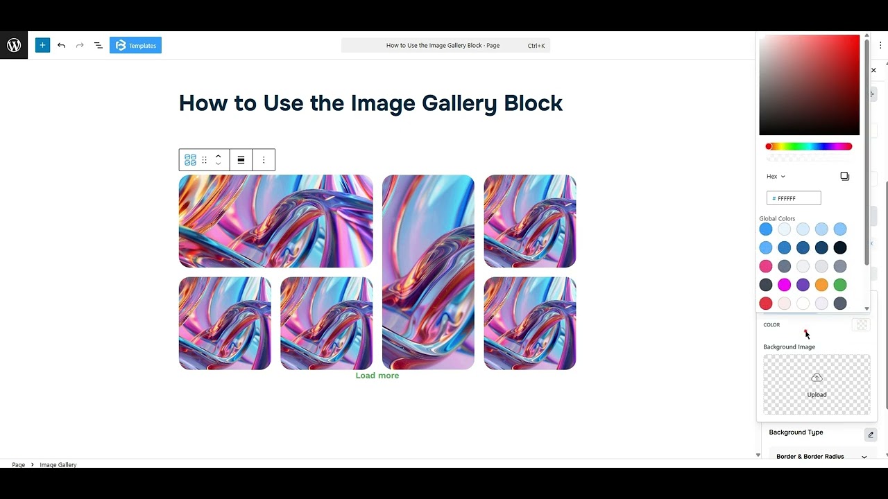
- Text Color: The text color feature lets you change the color of your button’s text in this context.
- Background Color: This feature lets you change the color of your button’s Background.
- Padding: Padding allows you to add spaces around an object to increase the inner area. You can also add space on a single side with this feature. Click on the Link icon and add or reduce the padding on any side you want.
- Margin: Margin enables the adjustment of an object’s placement on the canvas. With this feature, you can add a margin around an object or a single side. Click on the Link icon and add or reduce the Margin on any side you want.
- Button Border and Border Radius: This section lets you add the Border and customize the Border style, Border color, Border stroke, and Border radius of the button.
- Lightbox: The Lightbox feature enhances image viewing by opening large pop-ups with dimmed backgrounds. From this section, you can adjust the Size, Padding, Color, and Background color of the lightbox.
Extra Section
Z-Index: Consider the z-index as layers of sheets on a table. The greater the z-index, the more “above” the element appears. Therefore, if two elements intersect, the one with the greater z-index will be displayed in front.
However, it functions only when the element is positioned (relative, absolute, fixed, or sticky). Without it, z-index has no effect.
Overflow section: The Overflow feature in the Advanced section of Frontis Blocks controls how extra content behaves when it goes beyond the block’s size. The overflow property determines the action to take in this scenario.
Values of overflow:
- Visible:- The visible overflow value shows all content, even if it goes outside the box. It won’t be hidden or cut off, and no scrollbars will appear.
- Hidden: The hidden overflow value hides any content that goes outside the box. It gets cut off, and no scrollbars appear, so users can’t see the extra content.
- Scroll: The scroll overflow value always shows scrollbars. If the content is too big, you can scroll to see it. Even if there’s no extra content, scrollbars still appear.
- Auto: The auto overflow value adds scrollbars only when needed. If the content fits inside the box, no scrollbars show. If it overflows, scrollbars appear automatically.
- Clip: The clip overflow value hides any content that overflows the box without showing scrollbars. The extra content is simply cut off and cannot be seen or scrolled.
Padding: Padding allows you to add spaces around an object to increase the inner area. You can also add space on a single side with this feature. Click on the Link icon and add or reduce the padding on any side you want.
Margin: Margin enables the adjustment of an object’s placement on the canvas. With this feature, you can add a margin around an object or a single side. Click on the Link icon and add or reduce the Margin on any side you want.
Border and Shadow: You can place a border around the entire area and adjust the border color and border radius. This option allows you to apply a box shadow to the Image Gallery.
Responsive Control: In this section, you will get 3 switches (Hide on Desktop, Hide on Tablet, Hide on Mobile). These switches allow you to show or hide the section on various devices.
Custom CSS: If you are an expert or have coding knowledge, you can add custom CSS in this section to make it responsive.