
Table of Contents
Collapse allThe Frontis Feature List block allows you to display an organized list of features, services, or key points. Each item can include an icon, title, and description to highlight your offerings.
Adding Frontis Feature List Block
To insert the Frontis Feature List block, go to the page or post where you wish to add the Frontis Feature List block. Then click on the + (plus) icon at the top of the left side of the screen.
The Frontis menu bar interface will appear for you. Search for Frontis Feature List in the search box or select it from the menu bar.
After inserting the Feature List blocks, follow the steps below;
- Click on the Document Overview button, and you will be able to see the blocks list view on the right side.
- Click on the block; all the control tabs will show here (Basic, Style, Extra).
Basic section
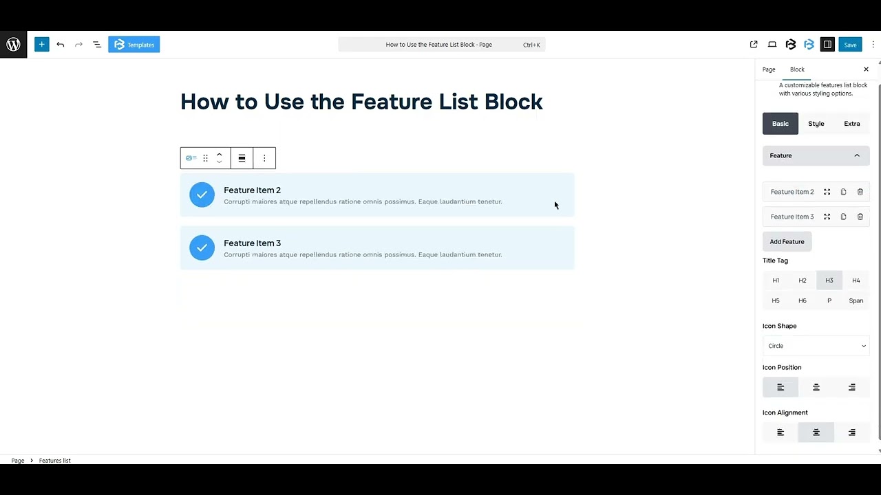
Basic > Feature
- Title: To change each Feature List’s text, tap on the feature item you want to change. The title text option will show on the right side. You can add any text here that will show in the Feature List’s title.
- Description: The description box is a short text under the feature title that explains the feature clearly. You can add any text here, and it will show in the Feature List description.
- Icon: This feature lets you add or remove an icon. You can also upload an image as an icon. In this section, you can customize each feature item’s icon color, background color, and text color.
- Add Feature: To add a Feature item, click on the Add Feature button. Here you can add as much as you need.
- Title Tag: Here you can choose the title tag (H1-H6, P, Span) for your title according to your work needs.
- Icon Shape: It allows you to change the icon shape. We offer three shapes (Circle, Square, and Rhombus). You can choose any one of them.
- Icon Alignment: The Icon Alignment helps to align the icon’s vertical position in the feature list. You can change the alignment to left, center, or right.
- Icon Position: The Icon Position feature lets you change the icon position to left, center, or right.
style section
List gap: You can customize the list gap as you wish, but you must leave a value in it; otherwise, this feature won’t work properly.
Style > Icon Section
- Icon color: The icon color feature lets you customize the icon color and background color. You can customize the icon color as you wish
- Icon Size: This feature lets you customize the icon size. You can customize the icon size as you wish
- Padding: Padding lets you add spaces around an object to increase the inner area. You can also add space on a single side with this feature. Click on the Link icon and add or reduce the padding on any side you want.
- Margin: Margin enables the adjustment of an object’s placement on the canvas. With this feature, you can add a margin around an object or a single side. Click on the Link icon and add or reduce the Margin on any side you want.
- Icon Border: You can also add the Border and customize the Border style, Border color, Border stroke, and Border radius of the Icon here.
- Box shadow: The box shadow is usually used to create the shadow around the element. It has four values: Horizontal offset (X), Vertical offset (Y), Blur, and Spread. You can also change the text shadow color from here.
Style >Image Section
- Width and height: Here, you can adjust the width and height of the image.
- Border: The border section lets you add a border around the image area and adjust the border color, size, and radius. If you don’t need any border, simply select the ‘None’ option.
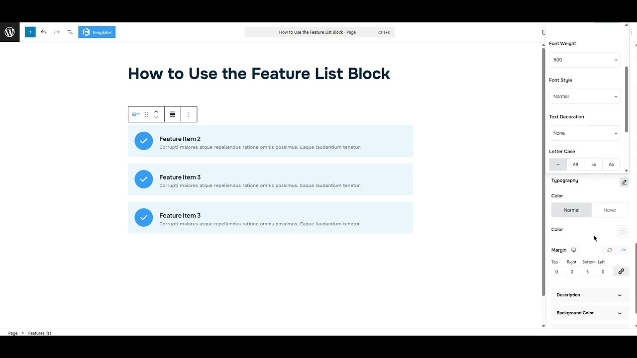
Title section: The title section allows you to customize the typography and typography color. You can also add a margin here.
Description section: This feature lets you customize the typography and typography color. You can also add a margin here.
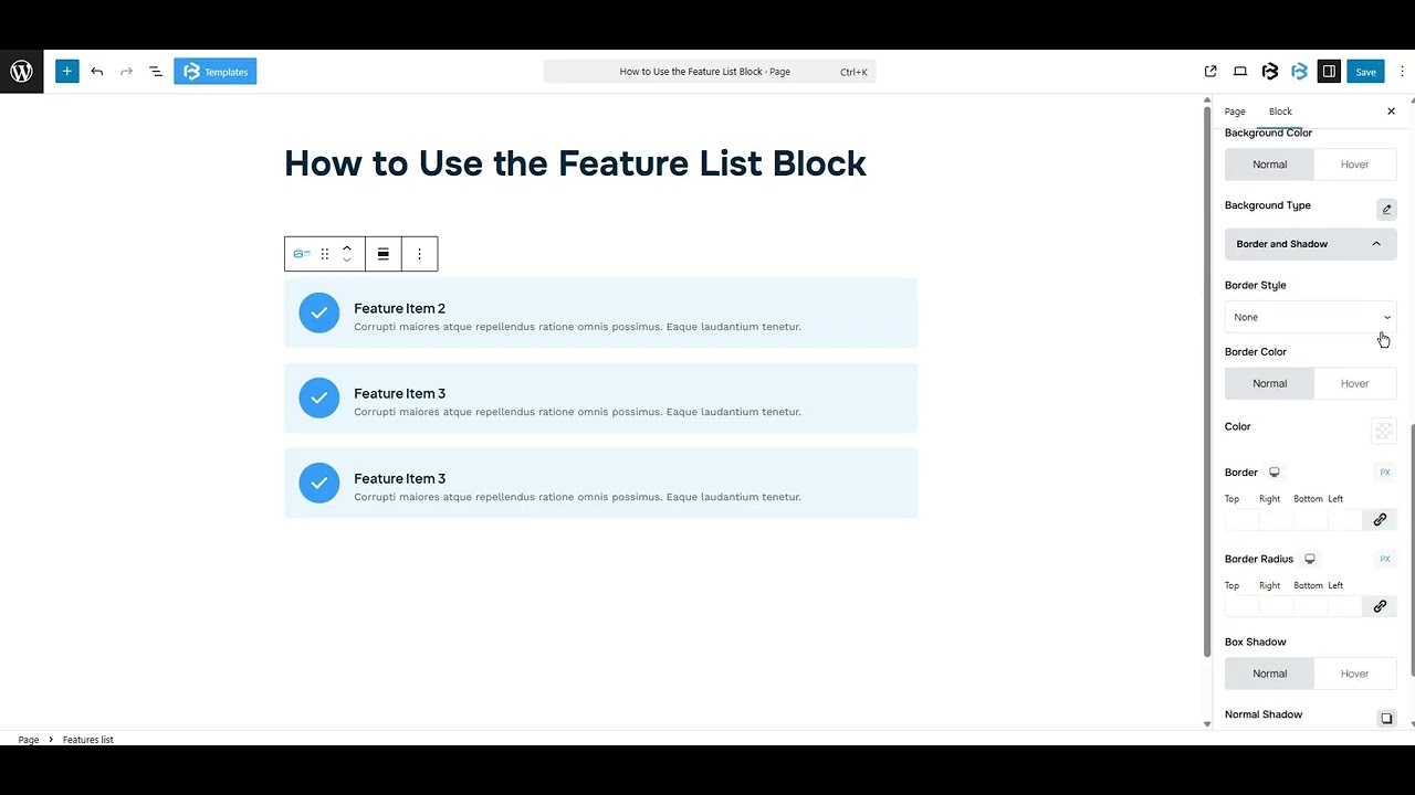
Background Color: The background color section allows you to change the background color of your Feature List. You can use solid or gradient colors, according to your project needs.
Padding: Padding allows you to add spaces around an object to increase the inner area. You can also add space on a single side with this feature. Click on the Link icon and add or reduce the padding value on any side you want.
Border and Shadow: Here, you can place a border around the entire area and adjust the border color and border radius. It also allows you to apply a box shadow to the Feature List.
Extra Section
Z-Index: Consider the z-index as layers of sheets on a table. The greater the z-index, the more “above” the element appears. Therefore, if two elements intersect, the one with the greater z-index will be displayed in front.
However, it functions only when the element is positioned (relative, absolute, fixed, or sticky). Without it, z-index has no effect.
Overflow section: The Overflow feature in the Advanced section of Frontis Blocks controls how extra content behaves when it goes beyond the block’s size. The overflow property determines the action to take in this scenario.
Values of overflow:
- Visible:- The visible overflow value shows all content, even if it goes outside the box. It won’t be hidden or cut off, and no scrollbars will appear.
- Hidden: The hidden overflow value hides any content that goes outside the box. It gets cut off, and no scrollbars appear, so users can’t see the extra content.
- Scroll: The scroll overflow value always shows scrollbars. If the content is too big, you can scroll to see it. Even if there’s no extra content, scrollbars still appear.
- Auto: The auto overflow value adds scrollbars only when needed. If the content fits inside the box, no scrollbars show. If it overflows, scrollbars appear automatically.
- Clip: The clip overflow value hides any content that overflows the box without showing scrollbars. The extra content is simply cut off and cannot be seen or scrolled.
Padding: Padding allows you to add spaces around an object to increase the inner area. You can also add space on a single side with this feature. Click on the Link icon and add or reduce the padding on any side you want.
Margin: Margin enables the adjustment of an object’s placement on the canvas. With this feature, you can add a margin around an object or a single side. Click on the Link icon and add or reduce the Margin on any side you want.
Border and Shadow: You can place a border around the entire area and adjust the border color and border radius. This option allows you to apply a box shadow to the List block.
Responsive Control: In this section, you will get 3 switches (Hide on Desktop, Hide on Tablet, Hide on Mobile). These switches allow you to show or hide the section on various devices.
Custom CSS: If you are an expert or have coding knowledge, you can add custom CSS in this section to make it responsive.