
Table of Contents
Collapse allThe Frontis Testimonial Block lets you add customer reviews or quotes to your site. It’s a great way to build trust and make your site look professional.
Adding Frontis Testimonial Block
To insert the Testimonial block, navigate to the post or page where you wish to include it. Next, tap the (+) plus icon located at the upper left corner of the display.
The Frontis menu bar interface will appear to you. Search for the Testimonial block in the search box or select it from the menu bar.
After inserting the Testimonial blocks, follow the steps below;
- Click on the Document Overview button, and you will be able to see the blocks list view on the right side.
- Click on the block; all the control tabs will show here (Besic, Style, Extra).
Basic section
- Presets Style: In this context, the presets style refers to a pre-created testimonial section. You can modify or personalize the testimonial section with a simple click. We offer five presets. You can choose any one of them.
- Element Visibility: In the General section, you’ll see some toggles like Show Rating, Show Title, Show Description, Show Avatar, Show Author, Show Designation, and Show Quote icon. Simply enable any switch to display that element in the testimonial.
- Alignment: This feature lets you align the testimonial left, right, and center according to your needs.
- Rating Icon: This setting lets you change the icon, adjust its position, or disable it based on your needs.
- Rating number: You can add between one and five icons for ratings in this section.
- Title: You can also customize the title text in this area. Simply add any text in the title section that will show in the testimonial section.
- Description: The description is a short text that explains the feature clearly. You can add any text here, and that will be shown in the testimonial.
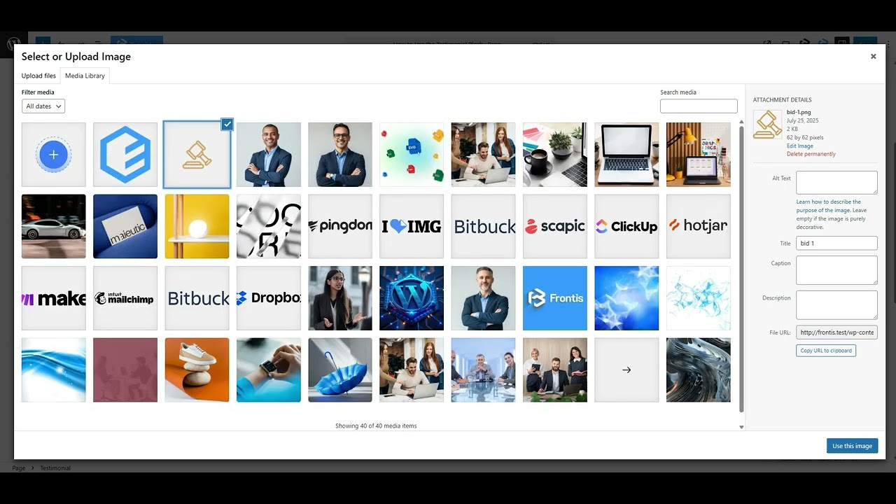
- Avatar: This feature lets you add a photo of the person giving the testimonial. It makes the review feel more real and personal.
- Designation: The designation feature lets you add the person’s job title under their name in the testimonial.
Style Section
Style > Rating Icon
- Icon size: Here, you can customize the rating icon’s size according to your needs.
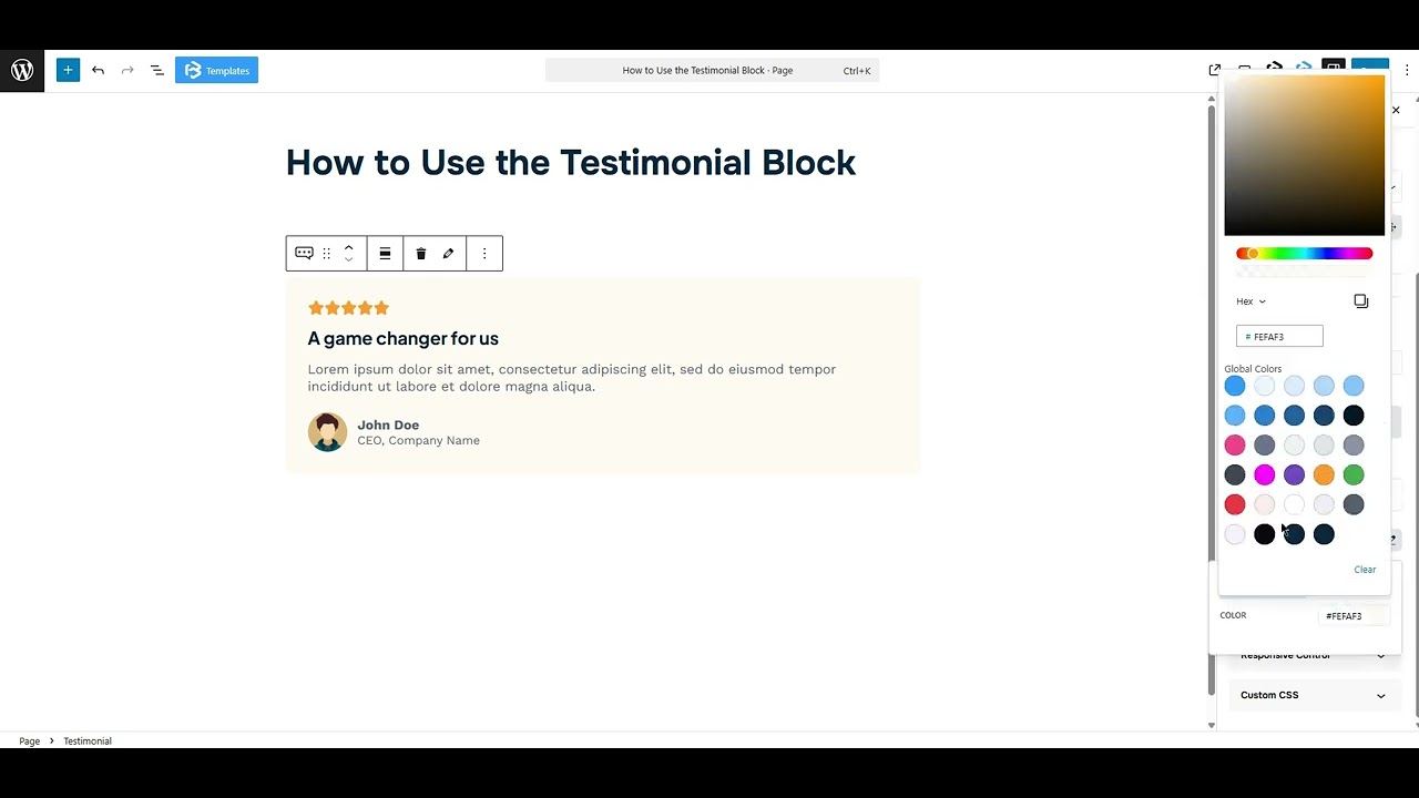
- Rating icon color: This section allows you to add or change the color of the rating icon.
- Margin: Margin enables the adjustment of an object’s placement on the canvas. With this feature, you can add a margin around an object or a single side. Click on the Link icon and add or reduce the Margin on any side you want.
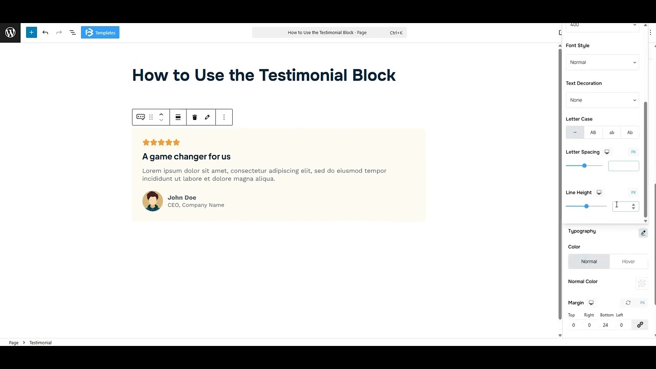
Title: This feature lets you customize the title tag (h1-h6, p, span), typography, and typography color. You can also add a margin here.
Description: This feature lets you customize the typography and typography color. You can also add a margin here.
Avatar: This feature lets you adjust the image width, border radius, and margin. You can also set the avatar’s position. Simply enable the Position toggle and customize the Top and Left values according to your needs.
Author name: This feature lets you customize the typography and typography color. You can also add a margin here.
Author Designation: This feature lets you customize the typography and typography color. You can also add a margin here.
Extra Section
Z-Index: Consider the z-index as layers of sheets on a table. The greater the z-index, the more “above” the element appears. Therefore, if two elements intersect, the one with the greater z-index will be displayed in front.
However, it functions only when the element is positioned (relative, absolute, fixed, or sticky). Without it, z-index has no effect.
Overflow section: The Overflow feature in the Advanced section of Frontis Blocks controls how extra content behaves when it goes beyond the block’s size. The overflow property determines the action to take in this scenario.
Values of overflow:
- Visible:- The visible overflow value shows all content, even if it goes outside the box. It won’t be hidden or cut off, and no scrollbars will appear.
- Hidden: The hidden overflow value hides any content that goes outside the box. It gets cut off, and no scrollbars appear, so users can’t see the extra content.
- Scroll: The scroll overflow value always shows scrollbars. If the content is too big, you can scroll to see it. Even if there’s no extra content, scrollbars still appear.
- Auto: The auto overflow value adds scrollbars only when needed. If the content fits inside the box, no scrollbars show. If it overflows, scrollbars appear automatically.
- Clip: The clip overflow value hides any content that overflows the box without showing scrollbars. The extra content is simply cut off and cannot be seen or scrolled.
Padding: Padding allows you to add spaces around an object to increase the inner area. You can also add space on a single side with this feature. Click on the Link icon and add or reduce the padding on any side you want.
Margin: Margin enables the adjustment of an object’s placement on the canvas. With this feature, you can add a margin around an object or a single side. Click on the Link icon and add or reduce the Margin on any side you want.
Border and Shadow: You can place a border around the entire area, and you can adjust the border color and border radius using this option. This option allows you to apply a box shadow to the testimonial block.
Responsive Control: In this section, you will get 3 switches (Hide on Desktop, Hide on Tablet, Hide on Mobile). These switches let you show or hide the section on different devices.
Custom CSS: If you are an expert or have coding knowledge, you can add custom CSS in this section to make it responsive.