
Table of Contents
Collapse allThe Call to Action block in Frontis lets you add a message and button to guide users toward the next step on your site, such as Sign Up, Buy Now, or Contact Us.
Adding Frontis Call to Action Block
To insert the Call to Action block, navigate to the post or page where you wish to include it. Next, tap the (+) plus icon located at the upper left corner of the display.
The Frontis menu bar interface will appear to you. Search for the Call to Action block in the search box or select it from the menu bar.
After inserting the Call to Action blocks, follow the steps below;
- Click on the Document Overview button, and you will be able to see the blocks list view on the right side.
- Click on the block; all the control tabs will show here (Basic, Style, Extra).
Basic Section
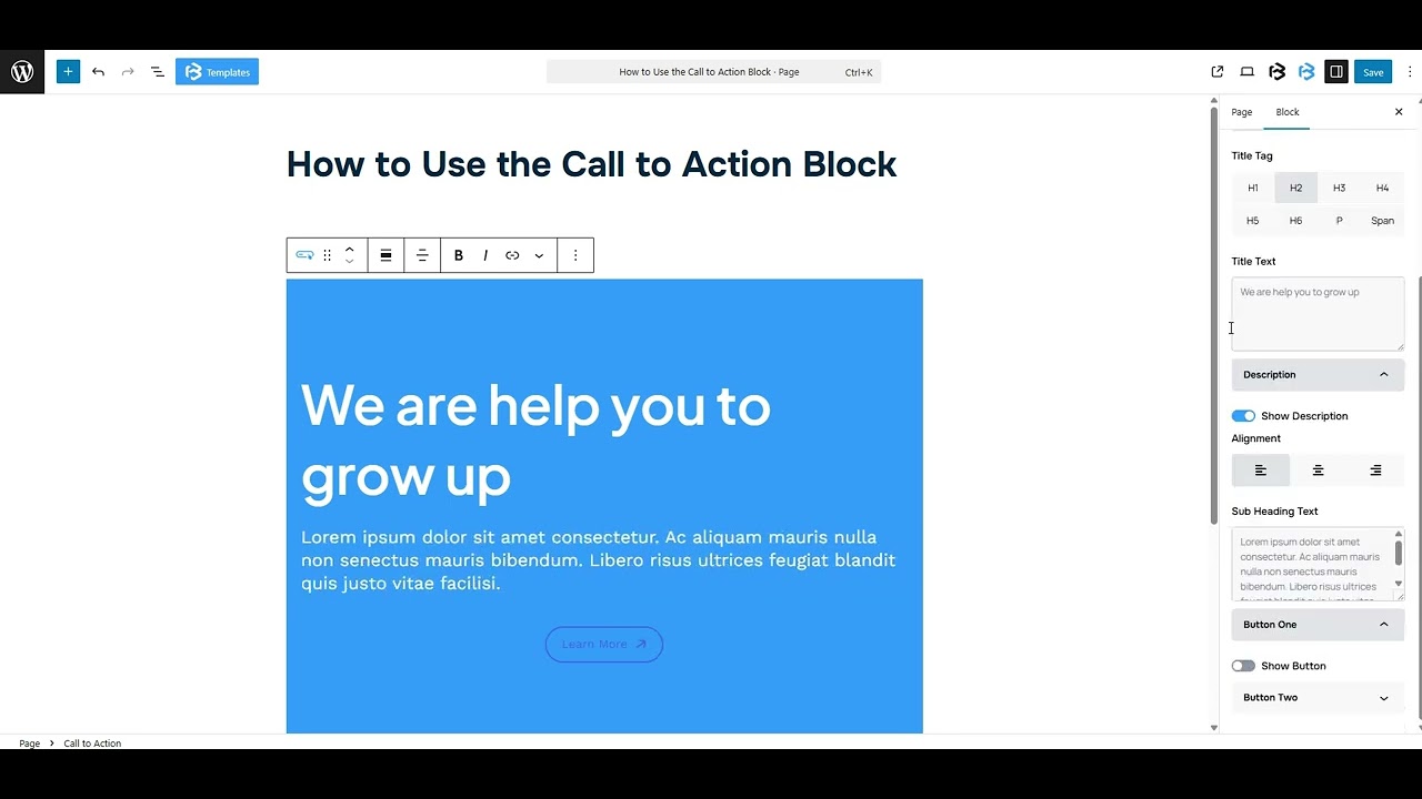
Title: You can easily set the title’s alignment (left, right, or center) and pick a tag like H1-H6, Paragraph, or Span, whatever works for your layout. You can also customize the heading text in this area. Simply add any text in the heading section that will show in the Call to Action title.
Description: The description is a short text that explains the feature clearly. You can add any text here, and that will be shown in the Call to Action description. Enable the “Show Description” toggle to show the alignment and subheading customization option.
Button One and Two: Enable the “Show Button” toggle to show the alignment, button text, and icon customization option.
- Alignment: Here, you can change the alignment of the button to left, right, and center.
- Button text: You can add any text here, and that will be shown in the button text description.
- Icon: To show the icon, simply enable the Show Button icon. After that, you can change the button or its position (left or right) here.
Style Section
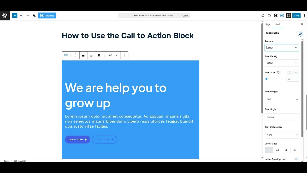
Style > Title
- Typography: You can change the font family, font size, font weight, font style, text transform, text decoration, letter spacing, and line height from here.
- Text Color: This feature lets you change the color of your call-to-action text.
- Padding: Padding allows you to add spaces around an object to increase the inner area. You can also add space on a single side with this feature. Click on the Link icon and add or reduce the padding on any side you want.
- Margin: Margin enables the adjustment of an object’s placement on the canvas. With this feature, you can add a margin around an object or a single side. Click on the Link icon and add or reduce the Margin on any side you want.
- Button Border and Border Radius: This section lets you add the Border and customize the Border style, Border color, Border width, and Border radius of the title.
Style > Description
- Typography: You can change the font family, font size, font weight, font style, text transform, text decoration, letter spacing, and line height from here.
- Text Color: This feature lets you change the color of your description text.
- Padding: Padding allows you to add spaces around an object to increase the inner area. You can also add space on a single side with this feature. Click on the Link icon and add or reduce the padding on any side you want.
- Margin: Margin enables the adjustment of an object’s placement on the canvas. With this feature, you can add a margin around an object or a single side. Click on the Link icon and add or reduce the Margin on any side you want
Style > Button One and Two
- Typography: You can change the font family, font size, font weight, font style, text transform, text decoration, letter spacing, and line height from here.
- Text Color: This feature lets you change the color of your button text.
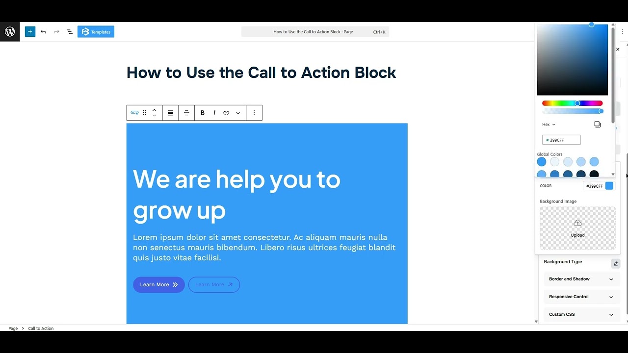
- Background Color: This feature lets you change the color of your Background.
- Icon Color: This feature lets you change the icon color of your button.
- Rotate Icon: The rotate icon feature lets you change the direction of the icon in the button, like turning an arrow left, right, up, or down.
- Padding: Padding allows you to add spaces around an object to increase the inner area. You can also add space on a single side with this feature. Click on the Link icon and add or reduce the padding on any side you want.
- Margin: Margin enables the adjustment of an object’s placement on the canvas. With this feature, you can add a margin around an object or a single side. Click on the Link icon and add or reduce the Margin on any side you
- Border: This section lets you add the Border and customize the Border style, Border color, Border width, and Border radius of the counter number.
Extra Section
Z-Index: Consider the z-index as layers of sheets on a table. The greater the z-index, the more “above” the element appears. Therefore, if two elements intersect, the one with the greater z-index will be displayed in front.
However, it functions only when the element is positioned (relative, absolute, fixed, or sticky). Without it, z-index has no effect.
Overflow section: The Overflow feature in the Advanced section of Frontis Blocks controls how extra content behaves when it goes beyond the block’s size. The overflow property determines the action to take in this scenario.
Values of overflow:
- Visible:- The visible overflow value shows all content, even if it goes outside the box. It won’t be hidden or cut off, and no scrollbars will appear.
- Hidden: The hidden overflow value hides any content that goes outside the box. It gets cut off, and no scrollbars appear, so users can’t see the extra content.
- Scroll: The scroll overflow value always shows scrollbars. If the content is too big, you can scroll to see it. Even if there’s no extra content, scrollbars still appear.
- Auto: The auto overflow value adds scrollbars only when needed. If the content fits inside the box, no scrollbars show. If it overflows, scrollbars appear automatically.
- Clip: The clip overflow value hides any content that overflows the box without showing scrollbars. The extra content is simply cut off and cannot be seen or scrolled.
Padding: Padding allows you to add spaces around an object to increase the inner area. You can also add space on a single side with this feature. Click on the Link icon and add or reduce the padding on any side you want.
Margin: Margin enables the adjustment of an object’s placement on the canvas. With this feature, you can add a margin around an object or a single side. Click on the Link icon and add or reduce the Margin on any side you want.
Border and Shadow: You can place a border around the entire area, and you can adjust the border color and border radius using this option. This option allows you to apply a box shadow to the call to action block.
Responsive Control: In this section, you will get 3 switches (Hide on Desktop, Hide on Tablet, Hide on Mobile). These switches let you show or hide the section on different devices.
Custom CSS: If you are an expert or have coding knowledge, you can add custom CSS in this section to make it responsive.