
Table of Contents
Collapse allThe Frontis Social Icon Block lets you display social media icons, such as Facebook, Instagram, and LinkedIn, on your website. It allows you to customize the icon style, icon color, and spacing. You can also add links to connect them to your social profiles.
Adding Frontis Social Icon Block
To insert the Social Icon block, navigate to the post or page where you wish to include it. Next, tap the (+) plus icon located at the upper left corner of the display.
The Frontis menu bar interface will appear. Search for the Social Icon block in the search box or select it from the menu bar.
After inserting the Social Icon blocks, follow the steps below;
- Click on the Document Overview button, and you will be able to see the blocks list view on the right side.
- Click on the block; all the control tabs will show here (Basic, Style, Extra).
Basic Section
- Presets Style: In this context, the presets style refers to a pre-created Social Icon section. You can modify or personalize the Social Icon section with a simple click. We offer six presets. You can choose any one of them.
- Alignment: In this section, you can change the alignment of your social icon section to left, right, and center.
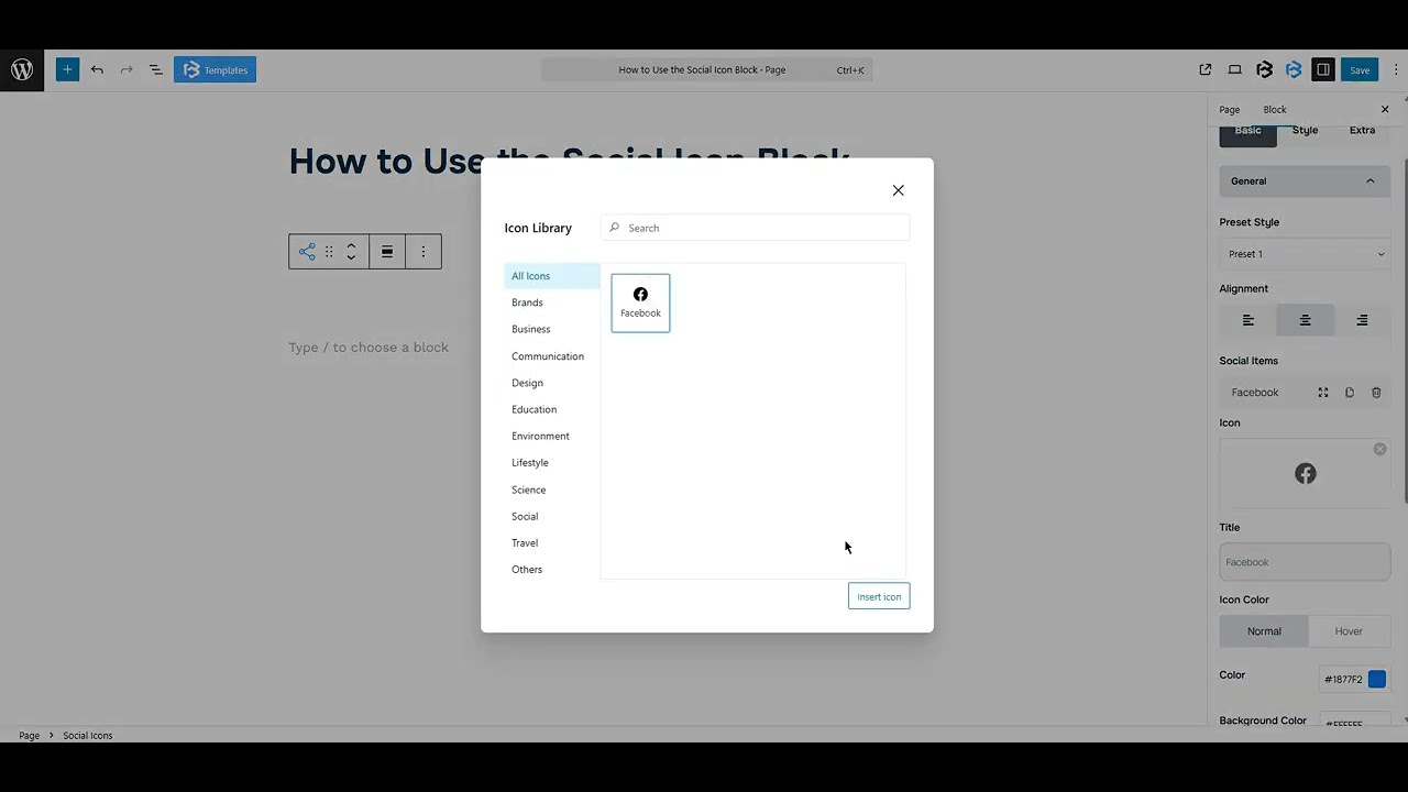
- Social Items: The Social Item feature lets you add and customize individual social media icons and links. You can choose platforms like Facebook, Twitter, or YouTube, and connect your profile link in the URL section for each one.
- This feature allows you to add a title and customize the icon color. To add a new item, click on the “Add Social Item” button. To delete an item, just click the bin icon.
Style Section
Style > Icon sectio
Background color: The background color feature lets you change the background color of the social icon.
Border: You can add the Border and customize the Border style, Border color, Border stroke, and Border radius of the Icon here.Icon Size: This feature lets you customize the icon size according to work needs.
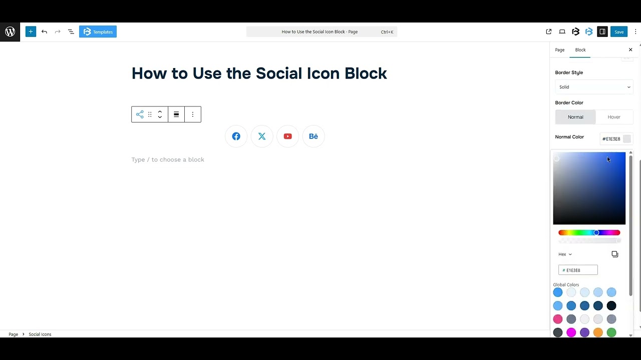
- Icon color: The icon color feature lets you customize the icon color and background color. You can customize the icon color as you wish
- Icon Border: You can also add the Border and customize the Border style, Border color, Border stroke, and Border radius of the Icon here.
- Padding: Padding allows you to add spaces around an object to increase the inner area. You can also add space on a single side with this feature. Click on the Link icon and add or reduce the padding on any side you want.
Title section: Turn on the “Title Switcher” to add a title. Once it’s on, the title section will appear.
- Typography: The typography section lets you change the font family, font size, font weight, font style, text transform, text decoration, letter spacing, and line height.
- Title color: Use this section to set a custom color for the title text.
- Padding: Padding allows you to add spaces around an object to increase the inner area. You can also add space on a single side with this feature. Click on the Link icon and add or reduce the padding on any side you want.
Padding and Margin:
- Column gap: The Column Gap feature in the Social Icon block controls the space between each social media icon. It helps to manage the space between social icons according to your work needs.
- Padding: Padding allows you to add spaces around an object to increase the inner area. You can also add space on a single side with this feature. Click on the Link icon and add or reduce the padding on any side you want.
- Margin: Margin enables the adjustment of an object’s placement on the canvas. With this feature, you can add a margin around an object or a single side. Click on the Link icon and add or reduce the Margin on any side you want
Extra Section
Z-Index: Consider the z-index as layers of sheets on a table. The greater the z-index, the more “above” the element appears. Therefore, if two elements intersect, the one with the greater z-index will be displayed in front.
However, it functions only when the element is positioned (relative, absolute, fixed, or sticky). Without it, z-index has no effect.
Overflow section: The Overflow feature in the Advanced section of Frontis Blocks controls how extra content behaves when it goes beyond the block’s size. The overflow property determines the action to take in this scenario.
Values of overflow:
- Visible:- The visible overflow value shows all content, even if it goes outside the box. It won’t be hidden or cut off, and no scrollbars will appear.
- Hidden: The hidden overflow value hides any content that goes outside the box. It gets cut off, and no scrollbars appear, so users can’t see the extra content.
- Scroll: The scroll overflow value always shows scrollbars. If the content is too big, you can scroll to see it. Even if there’s no extra content, scrollbars still appear.
- Auto: The auto overflow value adds scrollbars only when needed. If the content fits inside the box, no scrollbars show. If it overflows, scrollbars appear automatically.
- Clip: The clip overflow value hides any content that overflows the box without showing scrollbars. The extra content is simply cut off and cannot be seen or scrolled.
Padding: Padding allows you to add spaces around an object to increase the inner area. You can also add space on a single side with this feature. Click on the Link icon and add or reduce the padding on any side you want.
Margin: Margin enables the adjustment of an object’s placement on the canvas. With this feature, you can add a margin around an object or a single side. Click on the Link icon and add or reduce the Margin on any side you want.
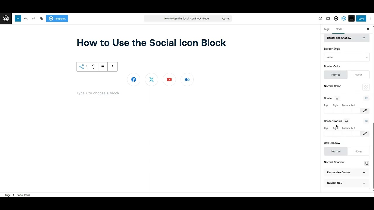
Border and Shadow: You can place a border around the entire area and adjust the border color and border radius. This option allows you to apply a box shadow to the social icon block.
Responsive Control: In this section, you will get 3 switches (Hide on Desktop, Hide on Tablet, Hide on Mobile). These switches let you show or hide the section on different devices.
Custom CSS: If you are an expert or have coding knowledge, you can add custom CSS in this section to make it responsive.