
Table of Contents
Collapse allThe Animated Heading in Frontis blocks allow text to move with effects such as Swirl or Typing. You can set your own words, choose the style, and adjust the Cursor and Suffix Text to make titles more eye-catching.
Adding Frontis Animated Heading Block
To insert the Animated Heading block, navigate to the post or page where you wish to include it. Next, tap the (+) plus icon located at the upper left corner of the display.
The Frontis menu bar interface will appear. Search for the Animated Heading block in the search box or select it from the menu bar.
After inserting the Animated Heading blocks, follow the steps below;
- Click on the Document Overview button, and you will be able to view the block list on the right side.
- Click on the block; all the control tabs will show here (Basic, Style, and Extra).
Basic Section

General Info
- Animation Type: This setting offers two animation styles, Typing and Swirl. Select either one based on your preference.
- Alignment: In this section, you can change the alignment of your Animated Heading to left, right, and center.
- Prefix Text: The Prefix Text in the Animated Heading block is the static text that appears before the animated words. It remains unchanged while the animation plays.
- Text Item: The Text Item is simply the main text you want to display with the animation effect. To add a text item, click Add Item. To remove one, click the bin icon.
- Cursor Switch: The Cursor Switch in the Animated Heading block lets you add or hide a blinking cursor at the end of the animated text.
- Suffix Text: The Suffix Text in the Animated Heading block is the static text that appears after the animated words.
- Text Gap: The Text Gap feature controls the spacing between the animated text and the static text (Prefix or Suffix).
Style Section
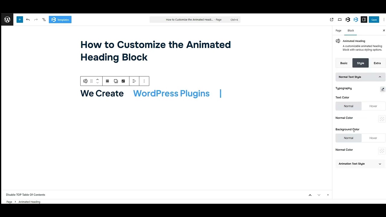
Normal Text Style
- Typography: You can change the font family, font size, font weight, font style, text transform, text decoration, letter spacing, and line height from here.
- Text Color: This feature lets you change the color of the heading text.
- Background color: The Background Color feature lets you set a background color behind the text.
Animation Text Style
- Typography: You can change the font family, font size, font weight, font style, text transform, text decoration, letter spacing, and line height from here.
- Text Color: This feature lets you change the color of the heading text.
- Background color: The Background Color feature lets you set a background color behind the text.
Extra Section
Z-Index: Consider the z-index as layers of sheets on a table. The greater the z-index, the more “above” the element appears. Therefore, if two elements intersect, the one with the greater z-index will be displayed in front.
However, it functions only when the element is positioned (relative, absolute, fixed, or sticky). Without it, z-index has no effect.
Background color: The Background Color feature lets you set a background color behind the text.
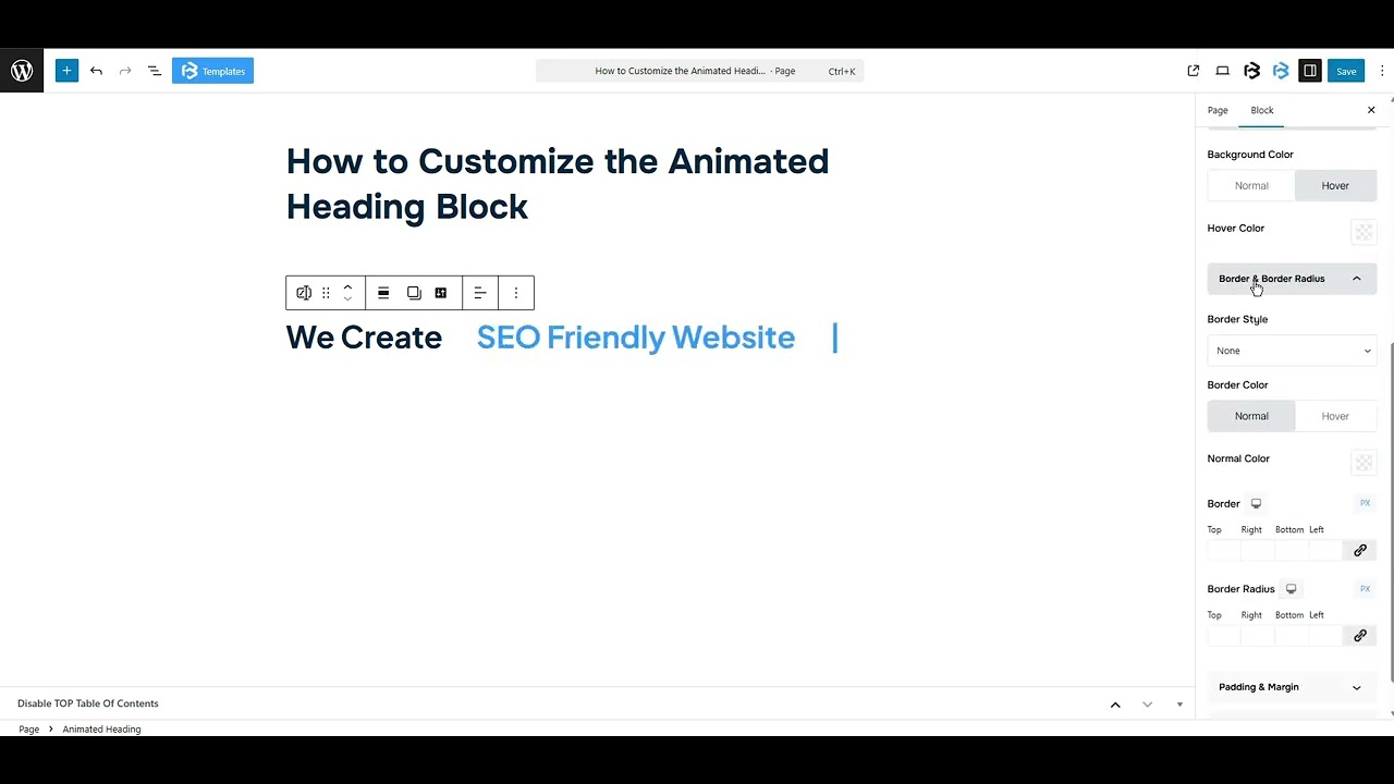
Border and Border Radius: You can place a border around the entire area and adjust the border color and border radius. This option allows you to apply a box shadow to the Animated Heading block.
Padding and Margin: Padding adds space inside an object, while Margin adds space outside it. You can adjust all sides together or each side separately using the Link icon.
Custom CSS: If you are an expert or have coding knowledge, you can add custom CSS in this section to make it responsive.