
Table of Contents
Collapse allThe Post Grid feature in Frontis Block shows your posts in a grid layout with rows and columns. It displays each post’s image, title, and a short excerpt, making everything look organised.
The Post Grid needs posts to display. If your page has no posts, the post grid will show nothing.
Adding Frontis Post Grid Block
To insert the Post Grid block, navigate to the post or page where you wish to include it. Next, tap the (+) plus icon located at the upper left corner of the display.
The Frontis menu bar interface will appear. Search for the Post Grid block in the search box or select it from the menu bar.
After inserting the Post Grid blocks, follow the steps below;
- Click on the Document Overview button, and you will be able to view the block list on the right side.
- Click on the block; all the control tabs will show here (Basic, Style, and Extra).
Basic Section
Premade Style: The Premade Style section gives you ready-made design styles for your grid. We provided two premade segments; you can choose any one of them.
Element Visibility: The element visibility section gives you some toggles, like (Show Author, Show Excerpt, Show Category, Show Tag, Show Date, Show Load More Button, and Show Read More Button). To show these elements on your post grid, simply enable the toggle.
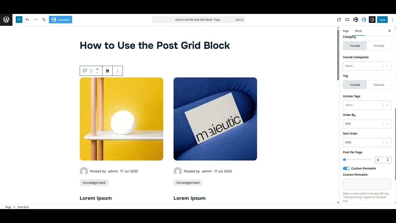
Query Section: The Query section in the post grid lets you choose which posts to display. You can filter posts by category, tag, author, or date. This helps you show only the specific posts you want in your grid.
- Post Per Page: The Posts Per Page feature controls the total number of posts displayed on one page.
- Custom Permalink: The custom permalink feature enables you to create a unique link for each post.
Post Switcher: The Post Switcher helps you show posts in a Grid or List style. Here you can customize Column number, Row Gap, and Column Gap to match your layout.
Filter By Taxonomy: This feature shows posts from specific categories, tags, or custom taxonomies. It controls which content appears in the post grid.
Pagination: Pagination breaks posts into pages with next and previous buttons to avoid showing all at once. This section gives you two types of pagination (pagination and button). You can choose any one of them.
- Pagination: When you select the Pagination option, the Pagination Type setting appears. You can choose either the Icon or Text style based on your needs.
- Button: When you select the Button option, additional settings appear. Here you can customize the button text or choose an icon.
Read More: The Read More button opens the full post when clicked. It shows below each post preview. Here you can customize the button text or choose an icon or image.
Style Section
Post Grid Item: The Post Grid section lets you change the background color, add padding and margin, select a border style and color, customize the border width and radius, and apply a box shadow.
Thumbnail: The Thumbnail section provides a thumbnail link toggle. You can customize the image size, width, height, add a border, select a border style and radius, and set the margin.
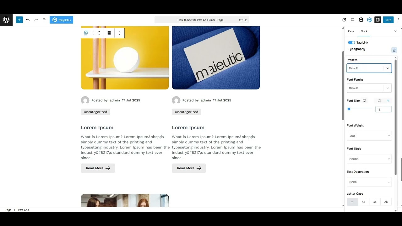
Title: The Title section includes a title link toggle. Here, you can customize the title tag, typography, color, and margin.
Description: The Description section lets you customize the title tag, typography, color, margin, and excerpt length.
Category: The Category section provides a category link toggle. It allows you to set typography, apply text and background colors, customize padding and margin, add a border, select a border style, define the border radius, and adjust the gap.
Tag: The Tag section provides a tag link toggle. It allows you to set typography, apply text colors, customize padding and margin, add a border, select a border style, define the border radius, and adjust the gap.
Author: The Author section in the Post Grid displays the name of the post author. Here, you can enable the author link toggle, adjust the gap, and add a margin.
- Show Author Avatar: The Show Avatar toggle displays the author’s profile picture next to their name in the post grid. Simply enable the toggle to show the avatar and set its size.
- Show Prefix: The Show Prefix toggle adds a short label before the category name, like “Posted by”. You can customize the prefix text and its color.
Load More Button: The Load More button loads additional posts without reloading the page. It allows you to customize typography, set text and loader colors, adjust icon size, customize icon and background colors, add a border, select a border style, and define the border radius.
Read More Button Image: This section helps you to customize the image width, height, gap, and rotation.
Skeleton Color: The Skeleton Color is the loading placeholder color shown before the post content appears.
- Background Color: The Background Color in the Skeleton Color setting controls the base color of the loading placeholder shown before the post content loads.
- Highlight Color: The Highlight Color in the Skeleton Color setting adds a light shimmer effect over the background while loading, making the placeholder look animated and smooth.
Extra Section
Z-Index: Consider the z-index as layers of sheets on a table. The greater the z-index, the more “above” the element appears. Therefore, if two elements intersect, the one with the greater z-index will be displayed in front.
However, it functions only when the element is positioned (relative, absolute, fixed, or sticky). Without it, z-index has no effect.
Overflow section: The Overflow feature in the Advanced section of Frontis Blocks controls how extra content behaves when it goes beyond the block’s size. The overflow property determines the action to take in this scenario.
Values of overflow:
- Visible: The visible overflow value shows all content, even if it goes outside the box. It won’t be hidden or cut off, and no scrollbars will appear.
- Hidden: The hidden overflow value hides any content that goes outside the box. It gets cut off, and no scrollbars appear, so users can’t see the extra content.
- Scroll: The scroll overflow value always shows scrollbars. If the content is too big, you can scroll to see it. Even if there’s no extra content, scrollbars still appear.
- Auto: The auto overflow value adds scrollbars only when needed. If the content fits inside the box, no scrollbars show. If it overflows, scrollbars appear automatically.
- Clip: The clip overflow value hides any content that overflows the box without showing scrollbars. The extra content is simply cut off and cannot be seen or scrolled.
Padding: Padding allows you to add spaces around an object to increase the inner area. You can also add space on a single side with this feature. Click on the Link icon and add or reduce the padding on any side you want.
Margin: Margin enables the adjustment of an object’s placement on the canvas. With this feature, you can add a margin around an object or a single side. Click on the Link icon and add or reduce the Margin on any side you want.
Border and Shadow: You can place a border around the entire area and adjust the border color and border-radius. This option allows you to apply a box shadow to the Progressbar block.
Responsive Control: In this section, you will get 3 switches (Hide on Desktop, Hide on Tablet, Hide on Mobile). These switches let you show or hide the section on different devices.
Custom CSS: If you are an expert or have coding knowledge, you can add custom CSS in this section to make it responsive.