
Table of Contents
Collapse allThe Frontis Advanced Image Block is a design element used in website builders that enables users to create a visually stunning hero section or featured image block with advanced customization options.
Adding Frontis Advanced Image Block
To insert the Frontis Advanced Image Block, go to the page or post where you wish to add the advanced image block. Next, tap the + (plus) Icon located at the top of the left side of the screen
The Frontis menu bar interface will appear to you. Search for the advanced image block in the search box or select it from the menu bar. Then, drag and drop the Advanced image block and upload a photo.
After inserting the Advanced Image Block, follow the steps below;
- Click on the Document Overview button, and you will be able to see the blocks list view on the right side.
- Click on the block; all the control tabs will show here (Basic, Style, Extra).
Basic section
- Image: After inserting the image, you can see it in the image section. Here, you can select or replace an image.
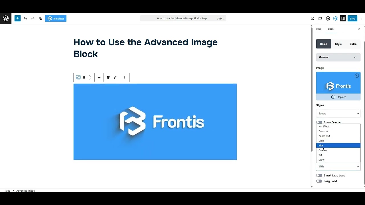
- Style: This feature lets you choose some styles for the image. You can customize the image shape (Square, Octagon, Triangle, Rhombus, Hexagon, and Bevel) with it. This function gives you some switch options (Show overlay, Display caption, Display title, and Enable link).
- Show overlay: The ‘Show Overlay’ option adds a semi-transparent layer over your image, making text easier to read and giving it a polished, modern look. Just turn it on to highlight content without editing the image.
- Display caption: To include a Display caption, simply turn on the switch. Once the switch is activated, the alignment section becomes visible. You can adjust the alignment of the caption (Left, center, and Right) in this section.
- Display title: To add the Display title, simply turn on the switch. Once the switch is activated, the title section becomes visible. Here, you can add your title or customize the title tag (H1-H6, P, and Span). You can also change the Title position here.
- Enable Link: To include the Enable link, simply turn on the switch. Once the switch is activated, the Enable link section becomes visible. Here, you can add a link.
- Hover Effect: This feature allows you to choose the premade hover effects (No Effect, Zoom In, Zoom Out, Slide, Blur, Overlay, Tilt, and Skew).
- Smart Lazy Load: Smart Lazy Load boosts your site speed by showing a preview image first, then loading the full image. Just turn it on to enable the feature and add your image.
- Lazy Load: Lazy Load makes your images load only when they’re about to show on screen. It helps your page load faster and run smoother.
Style section
Style > Image
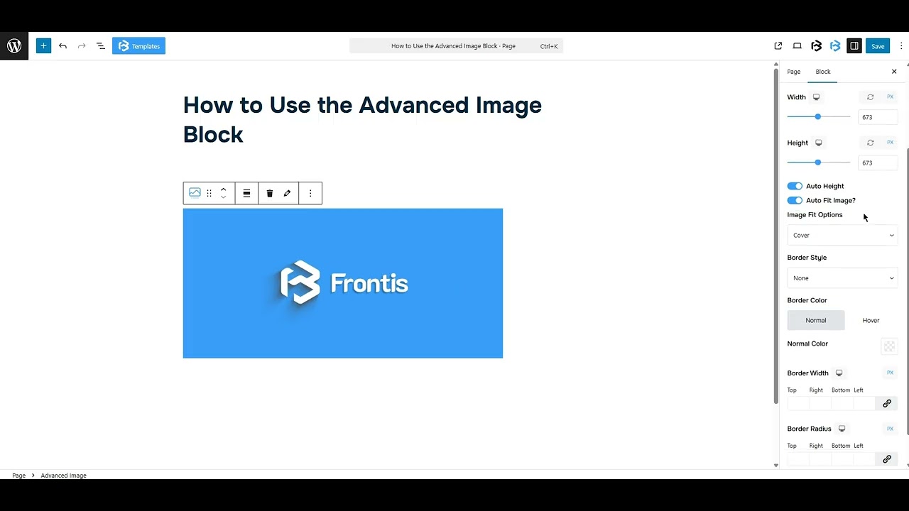
- Width and Height: Here, you can set the image’s width and height as you need. Or, turn on Auto Height to let it adjust the height automatically.
- Auto Fit Image: To include the Auto Fit Image, simply turn on the switch. Once the switch is activated, the Image Fit Options section becomes visible. You can select any option (Cover, Fill, and Contain).
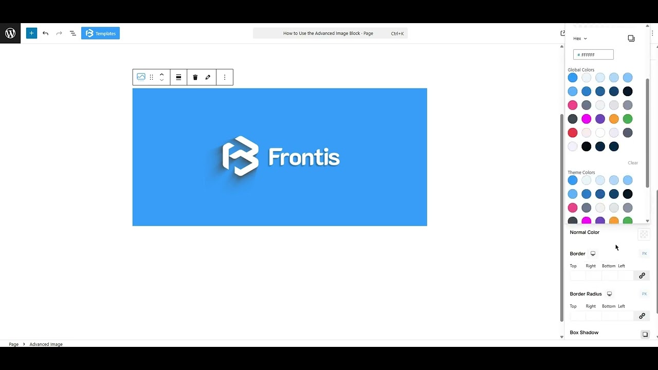
- Border: This feature allows you to add a border to the image, and you can change the border color, border size, and border style here.
- Box shadow: The box shadow is usually used to create the shadow around the element. It has four values: Horizontal offset (X), Vertical offset (Y), Blur, and Spread. You can also change the text shadow color from here.
Extra Section
Z-Index: Consider the z-index as layers of sheets on a table. The greater the z-index, the more “above” the element appears. Therefore, if two elements intersect, the one with the greater z-index will be displayed in front.
However, it functions only when the element is positioned (relative, absolute, fixed, or sticky). Without it, z-index has no effect.
Overflow section: The Overflow feature in the Advanced section of Frontis Blocks controls how extra content behaves when it goes beyond the block’s size. The overflow property determines the action to take in this scenario.
Values of overflow:
- Visible: The visible overflow value shows all content, even if it goes outside the box. It won’t be hidden or cut off, and no scrollbars will appear.
- Hidden: The hidden overflow value hides any content that goes outside the box. It gets cut off, and no scrollbars appear, so users can’t see the extra content.
- Scroll: The scroll overflow value always shows scrollbars. If the content is too big, you can scroll to see it. Even if there’s no extra content, scrollbars still appear.
- Auto: The auto overflow value adds scrollbars only when needed. If the content fits inside the box, no scrollbars show. If it overflows, scrollbars appear automatically.
- Clip: The clip overflow value hides any content that overflows the box without showing scrollbars. The extra content is simply cut off and cannot be seen or scrolled.
Padding: Padding allows you to add spaces around an object to increase the inner area. You can also add space on a single side with this feature. Click on the Link icon and add or reduce the padding on any side you want.
Margin: Margin enables the adjustment of an object’s placement on the canvas. With this feature, you can add a margin around an object or a single side. Click on the Link icon and add or reduce the Margin on any side you want.
Border and Shadow: You can place a border around the entire area and adjust the border color and border radius. This option allows you to apply a box shadow to the Image Block.
Responsive Control: In this section, you will get 3 switches (Hide on Desktop, Hide on Tablet, Hide on Mobile). These switches allow you to show or hide the section on various devices.
Custom CSS: If you are an expert or have coding knowledge, you can add custom CSS in this section to make it responsive.