
Table of Contents
Collapse allA contact form in Frontis blocks lets people send you messages directly from your website. It has fields for their name, email, and message, making it easy for visitors to contact you.
Install Contact Forms Plugin (if not already installed):
- Go to your WordPress Dashboard.
- Navigate to Plugins > Add New.
- Search for Contact Form 7 or WPForms.
- Click Install and then Activate.
Create a New Form
- For WPForms, go to WPForms → Add New.
- Choose a Simple Contact Form template.
- Edit fields if needed (Name, Email, Message).
- Click Save.
Adding Frontis Contact From Block
To insert the Contact Form block, navigate to the post or page where you wish to include it. Next, tap the (+) plus icon located at the upper left corner of the display.
The Frontis menu bar interface will appear. Search for the Contact Form block in the search box or select it from the menu bar.
After inserting the Contact Form blocks, follow the steps below;
- Click on the Document Overview button, and you will be able to view the block list on the right side.
- Click on the block; all the control tabs will show here (Basic, Style, Extra).
Basic Section
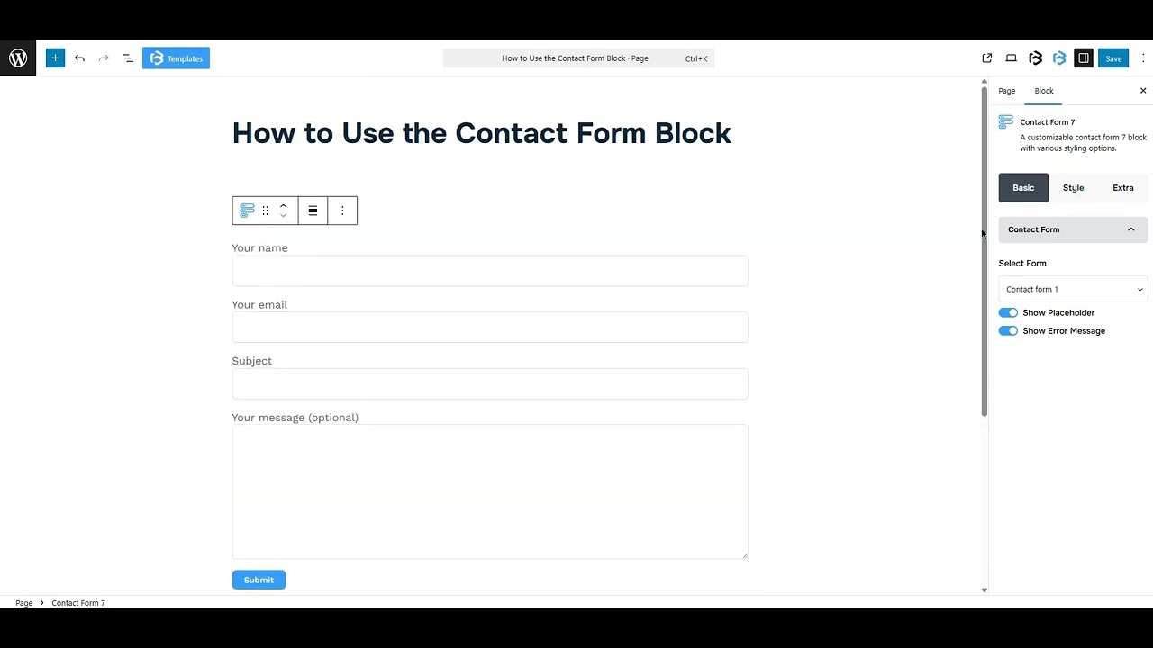
- Select a form: The Select Form option in the contact form block is used to choose which specific form you want to display on your page. It shows a drop-down list to pick the right form for your page.
- Show Placeholder: This section displays example text inside form fields to guide users on what to type, such as Enter your name. To show the placeholder, simply enable the toggle.
- Show Error Message option: This feature shows a warning message if a required field is left empty or has invalid input. It helps users correct it before submitting the form. To show the Error message, simply enable the toggle.
Style Section
Style > Label Section
- Color: Here, you can change the label text color.
- Typography: The typography section lets you change the font family, font size, font weight, font style, text transform, text decoration, letter spacing, and line height.
Style > Input & Textarea Section
- Background Color: Here, you can change the background color of the heading.
- Text Color: The text color feature lets you change the color of your text.
- Typography: The typography section lets you change the font family, font size, font weight, font style, text transform, text decoration, letter spacing, and line height.
- Text Indent: The Text Indent feature adds a small space before the text inside a box, so the text doesn’t touch the edge. It helps the form look clean and easy to read. Here you can add value as you need.
- Input Width: The Input Width option allows you to adjust the width of the input box. You can customize the box to full width, half width, or any specific size that suits your form layout.
- Input Height: The Input Height feature lets you change the size of the input box to make it taller or shorter based on your design
- Textarea Width: The textarea width feature controls how wide the text box looks on the screen. You can set it to full, half, or custom width. This helps fit the form layout better.
- Textarea Height: The textarea height refers to the vertical size of the text box. You can adjust the height of the textarea according to your requirements.
- Spacing: Spacing adds space around form fields. It allows you to add space in your text field as you need.
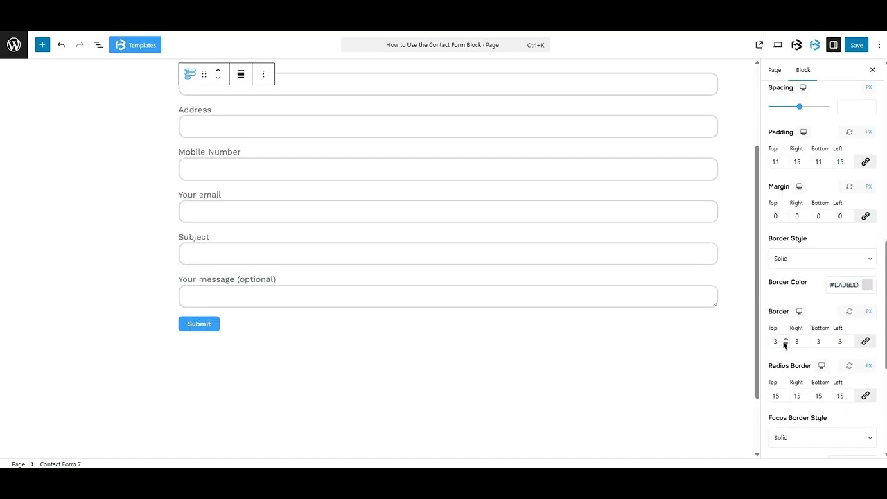
- Padding: Padding allows you to add spaces around an object to increase the inner area. You can also add space on a single side with this feature. Click on the Link icon and add or reduce the padding on any side you want.
- Margin: Margin adjusts an object’s placement by adding space around it. You can set margins for all sides or a single side. Click the link icon to change the margin as needed.
- Border and Border radius: Here, you can place a border around the entire area and adjust the border color and border-radius.
- Focus border: The focus border changes the border style or color when a user clicks on a field. It helps show which field is active.
- Focus Border Radius: The focus border radius controls how rounded the corners of a field appear when it’s clicked. It helps style the form to look smooth or sharp.
Style > Placeholder Section
Placeholder: The placeholder refers to sample text shown within a form field. It helps users understand what kind of information to enter, like “Enter your name” or “Type your message here.” It disappears when the user starts typing. This feature also lets you change the placeholder color.
Style > Success Message
The Success Message feature lets you change how the message looks after someone submits the form. It also allows adjusting the text style, background color, border, and border radius.
Style > Error Message
The Error Message feature lets you change how the message looks when there’s a problem with the form. It also allows adjusting the text style, background color, border, and border radius.
Extra Section
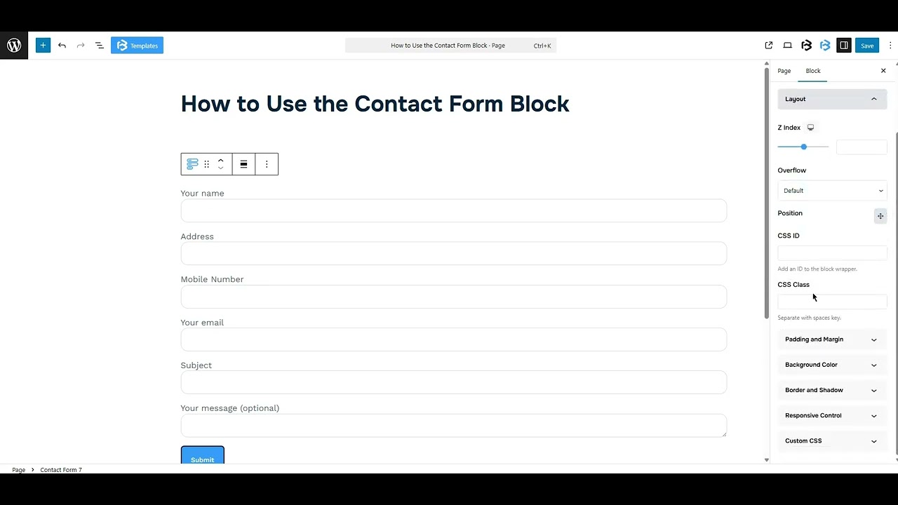
Z-Index: Consider the z-index as layers of sheets on a table. The greater the z-index, the more “above” the element appears. Therefore, if two elements intersect, the one with the greater z-index will be displayed in front.
However, it functions only when the element is positioned (relative, absolute, fixed, or sticky). Without it, z-index has no effect.
Overflow section: The Overflow feature in the Advanced section of Frontis Blocks controls how extra content behaves when it goes beyond the block’s size. The overflow property determines the action to take in this scenario.
Values of overflow:
- Visible: The visible overflow value shows all content, even if it goes outside the box. It won’t be hidden or cut off, and no scrollbars will appear.
- Hidden: The hidden overflow value hides any content that goes outside the box. It gets cut off, and no scrollbars appear, so users can’t see the extra content.
- Scroll: The scroll overflow value always shows scrollbars. If the content is too big, you can scroll to see it. Even if there’s no extra content, scrollbars still appear.
- Auto: The auto overflow value adds scrollbars only when needed. If the content fits inside the box, no scrollbars show. If it overflows, scrollbars appear automatically.
- Clip: The clip overflow value hides any content that overflows the box without showing scrollbars. The extra content is simply cut off and cannot be seen or scrolled.
Padding: Padding allows you to add spaces around an object to increase the inner area. You can also add space on a single side with this feature. Click on the Link icon and add or reduce the padding on any side you want.
Margin: Margin enables the adjustment of an object’s placement on the canvas. With this feature, you can add a margin around an object or a single side. Click on the Link icon and add or reduce the Margin on any side you want.
Border and Shadow: You can place a border around the entire area and adjust the border color and border radius. This option allows you to apply a box shadow to the Contact Form block.
Responsive Control: In this section, you will get 3 switches (Hide on Desktop, Hide on Tablet, Hide on Mobile). These switches let you show or hide the section on different devices.
Custom CSS: If you are an expert or have coding knowledge, you can add custom CSS in this section to make it responsive.