
Table of Contents
Collapse allThe Team Member block in Fronti Blocks helps you introduce your team in a simple, stylish way. You can add photos, names, roles, and social links in a clean layout.
Adding Frontis Team Member Block
To insert the Team Member block, navigate to the post or page where you wish to include it. Next, tap the (+) plus icon located at the upper left corner of the display.
The Frontis menu bar interface will appear. Search for the Team Member block in the search box or select it from the menu bar.
After inserting the Team Member blocks, follow the steps below;
- Click on the Document Overview button, and you will be able to view the block list on the right side.
- Click on the block; all the control tabs will show here (Basic, Style, and Extra).
Basic Section
Avatar Section: The avatar feature lets you add or change a team member’s profile image. Object fit and image overlay can also be customized here.
Content: The position of the content in this section can be customized to appear at the Top, Bottom, Left, Right, or in the Image.
Name & Designation: This section helps you to add or customize the team member’s name, name tag, and designation.
Description: The Description section includes a switch to enable the description field.
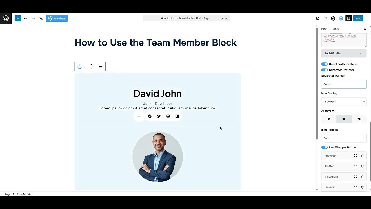
Social profiles: The Social Profiles section includes a switch to enable the social profile field. It also contains additional toggles, such as the Social Profile switch and the Separator switch. Simply enable the desired toggle to show its related option.
- Separator position: The position of the Separator in this section can be customized to appear at either the Top or the Bottom.
- Alignment: In this section, you can change the alignment of your social profile section to left, right, and center.
- Icon position: The Icon Position setting controls where the icon appears, either at the top or the bottom.
- Social Items: The Social Items feature enables you to add and customize social media icons and links. You can choose platforms like Facebook, Twitter, Instagram, or LinkedIn, and enter your profile URL in the URL field.
This feature allows you to add a title and customize the icon color. To add a new item, click on the “Add Social Profile” button. To delete an item, just click the bin icon.
Style Section
Avatar section
- Alignment: In this section, you can change the alignment of your Avatar section to left, right, and center.
- Height and width: Here, you can adjust the width and height of the Avatar.
- Border: The border section lets you add a border and customize its style, color, stroke, and radius of the Avatar section.
- Margin: Margin controls the space outside the element, helping to adjust its position on the canvas. You can add a margin to all sides or just one. Use the Link icon to manage each side separately.
Content section
- Alignment: In this section, you can change the alignment of your Content section to left, right, and center.
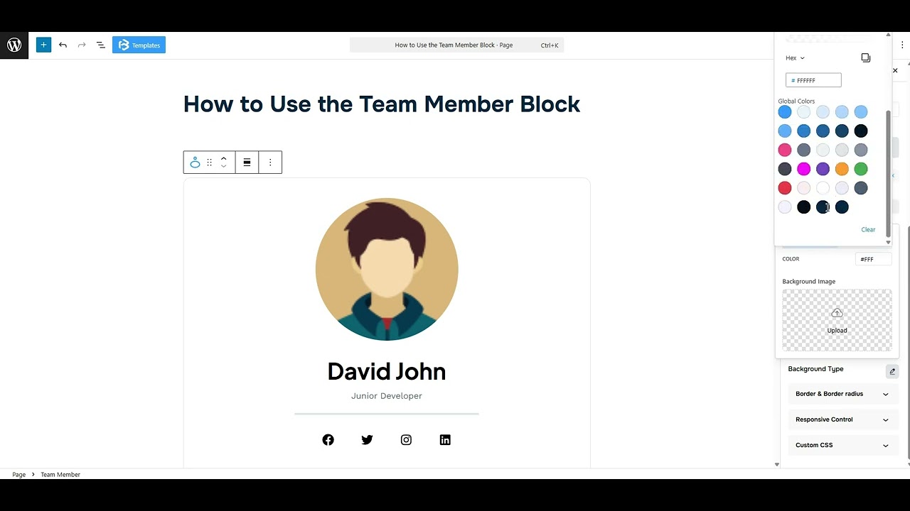
- Background Color: This function allows you to change the background color of your Team member section. You can use classic, gradient colors, or an image according to your work’s needs.
- Border: The border section lets you add a border and customize its style, color, stroke, and radius of the Team member block.
- Margin: Margin adjusts an object’s placement by adding space around it. You can set margins for all sides or a single side. Click the link icon to change the margin as needed.
- Padding: Padding allows you to add spaces around an object to increase the inner area. You can also add space on a single side with this feature. Click on the Link icon and add or reduce the padding on any side you want.
Content section
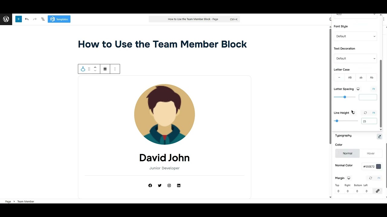
- Typography: You can change the font family, font size, font weight, font style, text transform, text decoration, letter spacing, and line height from here.
- Text Color: The text color feature lets you change the color of your text.
- Margin: Margin adjusts an object’s placement by adding space around it. You can set margins for all sides or a single side. Click the link icon to change the margin as needed.
Content section
- Typography: You can change the font family, font size, font weight, font style, text transform, text decoration, letter spacing, and line height from here.
- Text Color: The text color feature lets you change the color of your text.
- Margin: Margin adjusts an object’s placement by adding space around it. You can set margins for all sides or a single side. Click the link icon to change the margin as needed.
Social Icon Button section
- Icon Animation Type: This section gives you some animation options for the icon section: Default, Circle, Top, Right, Bottom, and Left. Choose any one of them as you need.
- Size: The Size section allows you to customize the icon size.
- Color: The Color feature lets you customize the icon color and background color.
- Padding: Padding allows you to add spaces around an object to increase the inner area. You can also add space on a single side with this feature. Click on the Link icon and add or reduce the padding on any side you want.
- Margin: Margin adjusts an object’s placement by adding space around it. You can set margins for all sides or a single side. Click the link icon to change the margin as needed.
- Border: The border section lets you add a border and customize its style, color, stroke, and radius of the Social icon button.
Social Profile Separator
- Alignment: In this section, you can change the alignment of your separator section to left, right, and center.
- Height and Width: Here, you can adjust the width and height of the Team member.
- Color: The Color feature lets you customize the separator color.
- Margin: Margin adjusts an object’s placement by adding space around it. You can set margins for all sides or a single side. Click the link icon to change the margin as needed.
Social Icons
- Icon Size: The Icon Size section allows you to customize the icon size.
- Icon Spacing: The Icon Spacing section allows you to adjust the spacing between icons.
- Color: The Color feature offers customization options for social icon colors.
- Margin: Margin adjusts an object’s placement by adding space around it. You can set margins for all sides or a single side. Click the link icon to change the margin as needed.
- Wrapper Border: The border section lets you add a border and customize its style, color, stroke, and radius of the Team member block.
- Single Icon Style: The Single Icon Style toggle adds individual style, like shape or background, to each icon.
- Color: The Color feature lets you customize the icon color and background color.
- Border: The border section lets you add a border and customize its style, color, stroke, and radius of the Social icon.
Extra Section
Z-Index: Consider the z-index as layers of sheets on a table. The greater the z-index, the more “above” the element appears. Therefore, if two elements intersect, the one with the greater z-index will be displayed in front.
However, it functions only when the element is positioned (relative, absolute, fixed, or sticky). Without it, z-index has no effect.
Overflow section: The Overflow feature in the Advanced section of Frontis Blocks controls how extra content behaves when it goes beyond the block’s size. The overflow property determines the action to take in this scenario.
Values of overflow:
- Visible: The visible overflow value shows all content, even if it goes outside the box. It won’t be hidden or cut off, and no scrollbars will appear.
- Hidden: The hidden overflow value hides any content that goes outside the box. It gets cut off, and no scrollbars appear, so users can’t see the extra content.
- Scroll: The scroll overflow value always shows scrollbars. If the content is too big, you can scroll to see it. Even if there’s no extra content, scrollbars still appear.
- Auto: The auto overflow value adds scrollbars only when needed. If the content fits inside the box, no scrollbars show. If it overflows, scrollbars appear automatically.
- Clip: The clip overflow value hides any content that overflows the box without showing scrollbars. The extra content is simply cut off and cannot be seen or scrolled.
Padding: Padding allows you to add spaces around an object to increase the inner area. You can also add space on a single side with this feature. Click on the Link icon and add or reduce the padding on any side you want.
Margin: Margin enables the adjustment of an object’s placement on the canvas. With this feature, you can add a margin around an object or a single side. Click on the Link icon and add or reduce the Margin on any side you want.
Border and Shadow: You can place a border around the entire area and adjust the border color and border-radius. This option allows you to apply a box shadow to the Progressbar block.
Responsive Control: In this section, you will get 3 switches (Hide on Desktop, Hide on Tablet, Hide on Mobile). These switches let you show or hide the section on different devices.
Custom CSS: If you are an expert or have coding knowledge, you can add custom CSS in this section to make it responsive.